Due to the fact that this is my first post I want to explain why I started blogging now and why I choose this Topic, and why I choose the R package ggplot2 to explain the anatomy of such a simple Thing as a barchart in comparison to the more fancy data visualizations that can be found using your favorite search engine (sooner or later, rather sooner) I will also share some of my D3 experiences).
I start blogging for a simple reason, a great deal of my knowledge comes from reading other blogs, where people are sharing their insights into data related topics, and now I’m feeling confident to start a blog by myself, hoping that other people can also learn something useful, and if not, I’m hoping that some of my posts are interesting enough to add a piece to the information lake, and do not add to the information swamp.
One of the main interests I have in data, is the visualization of data, not just because it’s one of the most discussed topics in the “data is the new oil / soil” realm, but because my personal belief is that it truly helps to convey meaning from data and also helps people to better understand their data. Maybe data visualization is some kind of data language or somehow works like the babel fish. This is the reason why I will start my blog with this post that also will mark the beginning of a little series about the anatomy of charts.
In my opinion it is necessary to understand the foundations of a data visualization before it will be possible to create more sophisticated (some may like to call it – fancy) visualizations. In this little series I choose the R package ggplot2 (developed by Hadley Wickham) for the data visualizaton mainly for two reasons.
First, ggplot2 is a visualization package that adhers to the Grammar of Graphics, introduced by Leland Wilkinson (http://www.amazon.com/The-Grammar-Graphics-Statistics-Computing/dp/0387245448).
Second – I can’t wait to combine the Microsoft Reporting Services weith R visualizations, this will also provide a lot of possibilities for future posts (in the meantime you can read about this feature here: http://www.jenunderwood.com/2014/11/18/r-visualizations-in-ssrs/)
This post will be about
- the width of the bars in a barchart
- the system areas in a chart
- the automatic enumeration of quantitative variables used on the xaxis
Please be aware that all the images and R.scripts can be downloaded from here: https://www.dropbox.com/sh/ifltrhw4yyv92ll/AAC79m0WNSr-GZE1kxMepT4ma?dl=0
So let’s start with a very simple barchart, like the one below …

The chart above was created using the script “anatomy of charts – part 1 – the barchart – 1.R”
Please be aware that this is not about why we should use a barchart or should use a pie chart or better not use a pie chart, but this is about some of the not that obvious aspects of charts and in this special case about some unobvious aspects of a bar chart.
This chart is based on a very simple dataset, that just has 2 variables:
category (the values are “A”, “B”, “C” and “D”) and
values (the values are 100, 80, 85 and 115)
This little R script creates the chart above:
library(ggplot2)
library(data.table)
dt.source <- data.table(category = c(“A”, “B”, “C”, “D”), values = c(100, 80,85,110))
p <- ggplot()
p <- p + labs(title = “a simple barchart”)
p <- p + geom_bar(data = dt.source, aes(x = category, y = values), stat = “identity”)
p
Before delving into ggplot2, I want to explain what’s happening if I’m executing the lines above.
The line
p <- ggplot()
creates an ggplot object and assigns the object to the variable p.
The line
p <- p + labs(title = “a simple barchart”)
adds a title to the plot.
The line
p <- p + geom_bar(…)
Adds a layer to the plot. A ggplot2 chart consists at least of one layer, in this example a barchart. Adding multiple layers to a chart is one of the great capabilities of ggplot2.
If you are not that familiar with ggplot2, you may wonder what this line
,stat = “identity”
is about:
Stats, are statistical transformations that can be used in combination with the graphical representations of data. These representations are provided by the different geom_… (see here for all the geoms http://docs.ggplot2.org/current/) available from within ggplot2.
The default stat for a barchart counts the observations of the variable used as xaxis, so that it is not necessary to “map” a variable to the y parameter of the geom_bar object. But normally I want to use a specific variable from the dataset to represent the value for the yaxis. This makes it necessary to provide the line
stat = “identity”.
Before digging deeper, this post will not and can not explain all the possibilities of the ggplot2 package or all the possibilities that come with R, so what I expect from the reader of this post is the following: you already have R installed, you are able to install the needed packages, if you are hinted by the library function that the specified package is not available. If you are more familiar with the R object data.frame than with a data.table object, it does not matter, at least not for this post, just a very short explanation: a data.table is a data.frame but much, much more efficient.
If you stare at the barchart, you will discover that there are spaces between the single bars (guess this does not take that much time), of course the three spaces between the bars are enhancing the readibility of the chart. But the question is, why do they appear and if needed, how can these spaces be controlled.
By default the width of a single bar is 0.9 units (whatever the units are) and is automatically centered above the corresponding variable (used as the x-axis of the chart). This means, that 0.45 units are left from the center and 0.45 units are on the right side of the center. The next images shows the same chart, the left image uses a barwidth of 0.5 and the right one a barwidth of 1.0.

The chart above was created with the R script “anatomy of charts – part 1- the barchart – 2.R”)
You can control the width for all the bars in a plot using the property width outside of the function aes(…) like this
p <- ggplot()
p <- p + geom_bar(data = dt.source, aes(x = category, y = values)
, stat = “identity”
,width = 0.5
)
p
If you are not that familiar with ggplot2, each geom, in this case geom_bar, has some aesthetics, for example the aesthetic “fill” that controls the background color for each bar, I will use this aesthetic somewhat later. Parameters or aesthetics used outside of the function aes(…) will set a value for the complete geom, whereas used inside the function, a variable of the dataset is mapped to that aesthetic and automatically scaled. The scaling of variables during the process of the mapping will be explained in a separate post in the near future. For now, please be assured that this will automagically produces the results that you want, in most of the cases.
I guess you also have discovered that there is some kind of margin on the left side of category A and also of the right side of category D. Not to mention the space between the bars and the x-axis. I colored these spaces red, blue and darkgreen. The next image shows the mentioned system areas (system areas if you are drawing a barchart), the property of the width of the bars has the value 1.0 (no spaces between the bars):

The chart above was created using the R script “anatomy of charts – part 1- the barchart – 3.R”
Looking at the script “anatomy of charts – part 1- the barchart – 3.R” you will discover one of the most intriguing aspects of ggplot and that is the possibility to create visualizations of multiple layers of geoms. The chart above consists of 4 layers:
- geom_bar(…)
- geom_rect(… fill = “red” …)
- geom_rect(… fill = “blue” …) and
- geom_rect(… fill = “darkgreen” …)
p <- ggplot()
p <- p + geom_bar(data = dt.source, aes(x = category, y = values)
,stat = “identity”
,width = 1.0)
#…
# mark the system area at the bottom of the chart
p <- p + geom_rect(aes(xmin = -Inf, xmax = Inf, ymin = -Inf, ymax = 0)
,color = “darkgreen”
,fill = “darkgreen”
)
p
First an “empty” ggplot object “p” is created, than a geom_bar(…) is added to the object (layer 1) and then a geom_rect() is added in this script example it represents layer 2 of the ggplot object and finally the object is called, this leads to the drawing of the plot.
Each geom that is used can have its own dataset (this is the case for this example) or use a shared dataset. This capability (the layering of geoms_*) provides the possibility to build sophisticated data visualizations very easily.
The system areas (red, blue, and darkgreen) are helpful if you do not want to overlook points that would be drawn very closely to one of the axis or even on top of the axis. But this extra space is rarely used in business charts at least to my experience, for this reason I often use the following lines in my data visualizations:
p <- p + scale_x_discrete(expand = c(0,0))
p <- p + scale_y_continuous(expand = c(0,0))
These lines prevent the plotting of the extra spaces, the next image shows the effect of using these two additional lines (“anatomy of charts – part 1 – the barchart – 4.R”) in the script from the start.

In the next few paragraphs (before finishing my first post) I want to explain why I like to think about rectangles instead of bars.
First, looking at the parameters of the aes-function of the
geom_rect(…, aes(xmin, xmax, ymin, ymax, …)), it looks somewhat familiar to the parameters of the
geom_bar(…, aes(x, y, …),…).
If I’m saying that a rectangle (some may call it a bar), that is drawn by geom_bar, starts or has its origin on the x-axis (y = 0) and geom_bar takes care of the direction of the bar (plus or minus values), I just need to provide one value for the height of the bar.
So I guess it is valid to say that the parameter ymin can be omitted (defaulted to 0) and ymax of geom_rect() corresponds to the parameter y of geom_bar().
The explanation how x from geom_bar() translates to xmin and xmax of geom_rect will not be that easy, but once understood, this provides a lot of possibilities.
It will be necessary to understand that there are two types of variables within a dataset: quantitative and qualitative. In the little dataset that I use for this post this distinction can be made very easily.
The variable “category” is the qualitative variable and the variable “values” is the quantitative variable. Almost naturally we map the variable category to the xaxis and the variable values to the yaxis. It is necessary to understand that the values of the qualitative variables are indexed, “A” is indexed with the numerical value 1, and “C” with the numerical value 3. The first (the leftmost) value of the qualitative variable always has the index 1 and last (the rightmost) the value n (n represents the number of distinct values of the qualitative variable).
This leads to the following parameters for geom_rect for A and C:
A(1) := xmin = 1-(0.9/2), xmax=1+(0.9/2), ymin = 0, ymax = 100
C(3) := xmin = 3 -(0.9/2), xmax = 3+(0.9/2) , ymin = 0, ymax = 110

The chart above was drawn by the script “anatomy of charts – part 1 – the barchart – 5.R”
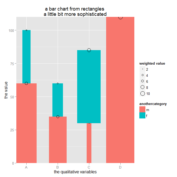
In the next post I will explain how the below barchart is drawn and how to mince your data in preparation for the drawing using the data.table package: