This post is the 3rd post in a series on how to use the R package ggplot2 to create data visualizations, but before delving into R code here comes a little confession.
For a couple of years (decades) I’m an avid user of the SQL Server Data Platform, spanning of course the relational database engine designing and implementing DWHs, but also building analytical applications using MS SQL Server Analysis Services Multidimensional and Tabular. But for a couple of reasons I never get along with the Reporting Services as a platform for Business Intelligence solutions on top of the data stores. With the upcoming release of SQL Server 2016 and Microsoft’s BI strategy (disclosed at the PASS Summit 2015) this will change dramatically.
With the upcoming release of SQL Server 2016, Reporting Services will become the foundation for on premises BI architectures, after the initial release it will also become possible to publish the interactive Power BI Desktop (disclaimer: I’m addicted) Reports and Dashboards to Reporting Services. In the current release of SQL Server 2016 there is already a new web service available (free of Sharepoint) that will host the reports and there already is the possibility to design Dashboards for mobile devices. The technology of DataZen (acquired by Microsoft some time ago) is integrated into Reporting Services.
The above mentioned in combination with the integration of the statistical framework R into the SQL Server 2016 makes this post not just the 3rd in a series on how to create Data Visualizations with R (using ggplot2), but also the first post that describes the benefits of the integration of R into the SQL Server. In this special case how to use R visualizations within SQL Server Reporting Services.
Due to the fact that Microsoft is moving with an unbelievable pace, this post will become somewhat lengthy. This is because this post will of course describe some R scripting to create another Data Visualization, but will also be the beginning of a couple of posts that describe how and much more important why one should use R in combination with SQL Server.
Please be aware, that whenever I mention SQL Server or Reporting Services. I’m referring to the currently available pre-release of SQL Server 2016, known as SQL Server 2016 CTP 3.2
You can find all files in this Dropbox folder https://www.dropbox.com/sh/wsrgpsb6b6jfl6a/AABwsnNFN_djU8i5KUEEHWp7a?dl=0
There is a R script “hichertexample without reporting services.R” that you can use without the Reporting Services, just from within your favorite R IDE. Just be aware that the R script tries to acces a ODBC source called “rdevelop”. To create the table that is used by the R script execute the SQL script from “HichertExample.sql”.
To avoid any confusion, do not use any script, file or anything else I provide on a production environment.
First things first, the data visualization!
This time my custom R visualization was inspired by an older Hichert chart (the inventor of the International Business Charting Standards – IBCS: http://www.hichert.com/). The Excel File that I used for this example can be found here: http://www.hichert.com/excel/excel-templates/templates-2012.html#044A.
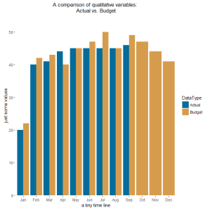
We are (I’m) using bar charts to compare qualitative variables, like the chart below:
Actual Values are compared with Budget Values, sometimes Actual Values are missing. In the chart above, Actual Values are missing for the months October to December.
Depending on the use case for the visualization it is also somewhat difficult to identify if the Budget Values are above or below the Actual Values. Not to mention, if there is a trend in the achievement of the Budget Values.
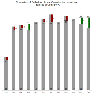
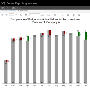
For this reason, I like the charting type below, it easily communicates the gap between the Budget Values and the Actual Values and also visually indicates that Forecast Values were used for the months October to December by using a dotted line for the x-axis.
The chart above shows the Budget Values (grey column) and Actual Values (black line) and the difference between the Budget Values and Actual Values / Forecast Values (months October to December) as a colored rectangle. A red rectangle indicates lower Actual Values and a green rectangle higher Actual Values.
The Budget Value is labeled at the root of the columns, whereas the Actual Values are labeled above or below the Actual Value indicator (the black line).
Now, it’s time to delve into some R code.
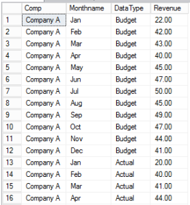
There is some kind of data preparation necessary, here is a little screen that depicts the structure of the data:
I call this kind of structure “long format” in contrast to “wide format”. If one wants to visualize data using ggplot2 it’s always a good idea to have the data in the “long format”. To give you an idea if your data has the “long format” or the “wide format” just use this simple rule (truly oversimplified): long format means “more rows” whereas “wide format” means “more columns”. If you are familiar with the SQL operators PIVOT and UNPIVOT, you will know what I’m talking about.
By the way – this sample data can be created using the file “HichertExample.sql”. I would not recommend to execute this SQL statement in a production environment, even if I took great care not to DROP any objects that were not created within the same statement.
Please be aware that I will explain somewhat later in this post how to pass datasets and other variables to a R script that will be executed within the SQL Server (almost within).
But for this special case I want to have my data in the wide format, due to the fact that I will create some additional information depending on the values of the column “DataType”. I call the process of transforming a long dataset into a wide dataset: pivoting (transforming rows into columns).
For this reason I use the following line in my R script:
dt.cast <- dcast(dt.source,Comp + Monthname ~ DataType, value.var = “Revenue” , fun = sum, fill = NA);
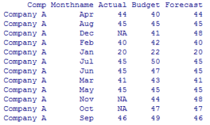
This function uses the data.table object “dt.source” and creates a new object “dt.cast”. After applying this function to the data.table “dt.source”, the new data.table will look like this:
Since version 1.9.6 the R package data.table provides the function “dcast” to pivot columns, for this reason it is no longer necessary to use the package reshape2.
For a couple of reasons I always use the package “data.table” for all kinds of data preparation, mainly because of performance and not to lose my focus. I’m aware that there are packages available that also can be used, but I will use the package “data.table” until there will be a package that does all the stuff in a fraction of time (happy waiting!).
As one can see, there are no Actual Values for the month Oct, Nov, and Dec. For this reason, I will create two additional columns that will be used during the charting:
dt.cast[, UseForecastValue := ifelse(is.na(Actual), 1,0)];
dt.cast[, ComparisonValue := ifelse(is.na(Actual), Forecast,Actual)];
The first line creates the column UseForecastColumn and assigns the value 1 if the Actual Value is missing. The second line creates the column ComparisonValue and assigns the value from the Actual column if a value present and from the Forecast column if not.
The next lines ensure that the data.table dt.cast is properly sorted by an index number assigned to a MonthName:
dt.monthordered = data.table(
Monthname = c(“Jan”,”Feb”,”Mar”,”Apr”,”May”,”Jun”,”Jul”,”Aug”,”Sep”,”Oct”,”Nov”,”Dec”),Monthindex = c(1,2,3,4,5,6,7,8,9,10,11,12));
setkey(dt.monthordered,Monthname);
setkey(dt.cast, Monthname);
dt.cast <- merge(dt.cast,dt.monthordered, by = “Monthname”);
setorder(dt.cast, Monthindex);
The first line creates the data.table “dt.monthordered”. The next two lines create an index for the column in the data.tables.
Using merge in the next line combines both data.tables and finally the data.table “dt.cast” gets ordered by the column MonthIndex.
The rectangles, depicting the difference between the Actual / Forecast Value and the Budget Value, are drawn using the geom_rect(…), therefore it is necessary to determine the height of the rectangle, this is done by the next line:
dt.cast[, diffCompareBudget := ComparisonValue – Budget][] #diff ComparisonValue-Budget;
Simply a new column is created “diffCompareBudget”.
The next lines create a numerical index for the values shown on the xaxis, this index is stored in the column “category.level.ordinal”. This value is used later on to determine the coordinates along the xaxis for the rectangles:
dt.cast$category <- factor(dt.cast$Monthname, levels = unique(dt.cast$Monthname));
category.levels <- levels(dt.cast$category);
names(category.levels) <- c(levels(dt.cast$category));
dt.cast$category.level.ordinal <- as.numeric(match(dt.cast$category, category.levels));
Then there are some lines creating boolean values to tweak the chart, this is one of great possibilities provided by the ggplot2 package, build the chart in layesr that can be addes or omitted, just by encapsulating these layers in a simple if-clause:
show.BudgetValues <- TRUE;
show.BudgetLabels <- TRUE;
show.ActualLabels <- TRUE;
show.diffValues <- TRUE;
show.diffLabels <- TRUE;
show.actLine <- TRUE;
show.zeroline <- TRUE;
And of course then the drawing of the chart begins 🙂
Basically this is straightforward …
First an ggplot2 object is initialized using
p <- ggplot();
Each of the used layer of the chart is contained within an if-clause that adds the layer to the chart or not 😉
If(){
P <- p + geom_…(…);
};
In preparation for the usage of this chart in a report of SQL Server Reporting Services the final chart is rendered as a binary object using thes four lines:
image_file = tempfile();
png(filename = image_file,width = 900,height=700,res=144);
print(p);
dev.off();
OutputDataSet <- data.frame(data=readBin(file(image_file, “rb”), what=raw(), n=1e6));
I guess the last line can be a little confusing, for this reason here is some additional explanation:
The stored procedure that executes the R script “sp_execute_external_script” returns an object, a result object. This object has to have the name “OutputDataSet”. The temporarily created file “image_file” is assigned to this result object. Due to the fact that the Reporting Services expect a binary, readBin(…) is used.
And now – some words about the R integration in SQL Server 2016 and the usage of custom Data Visualizations in SQL Server 2016 Reporting Services.
If you want to try this at home 🙂 You have to use this Version of SQL Server 2016: SQL Server 2016 CTP 3.2 (found here: https://technet.microsoft.com/de-de/evalcenter/mt130694.aspx)
During installation of SQL Server, make sure you checked the new “Advanced Analytics Extensions” option and also executed the post-installation process, that is described here (https://technet.microsoft.com/en-us/library/mt590808.aspx).
Due to the fact that custom Data Visualizations in SQL Server Reporting Services are image files (I like that), this part is just very simple. Provide something to Reporting Services that is a binary. I already explained how to create a binary (in my example a png file) from within the R script.
Check!
To leverage the power of R from within SQL Server basically a new system stored procedure “sp_execute_external_script” is executed from within another stored procedure. In my example the stored procedure “dbo.getHichertExample_plot” calls this new system procedure.
The dataset “getHichertExample” of the Report “HichertExample” queries its data using a stored procedure and passes the seleceted company as a parameter to the stored porcedure like this
exec getHichertExample_plot @comp ;
This stored procedure assembles the SQL statement that provides the input data for the R script and executes the new system stored procedure “sp_execute_external script”. This stored procedure and its parameters are described here (https://msdn.microsoft.com/en-us/library/mt604368.aspx). The usage of this procedure is quite simple, assuming you have some T-SQL experience.
To make all this work smoothly it is necessary to consider some security issues, meaning the privileges:
- the user needs at least some kind of data access to the source table meaning for example being a member of the db_datareader role
- the user has to be a member of the new SQL Server database role “db_rrerole”
- the user needs a grant to execute the procedure “getHichertExample”
- the user needs the privilege to execute external scripts
The SQL file “the security stuff.sql” contains the statements that are necessary to provide the proper access rights to make my example work, I guess this could become handy in the future as well.
And after publishing the report to your report server, the report will look like this in the new web portal of Reporting Services 2016:
This simplicity is astonishing; this combines the power of two outstanding platforms in a way that will at least provide topics for my future posts 🙂
Thanks for reading!
As soon as I found this website I went on reddit to share some of the love with them.
Thank you for sharing superb informations. Your web-site is very cool. I’m impressed by the details that you’ve on this site. It reveals how nicely you understand this subject. Bookmarked this website page, will come back for extra articles. You, my pal, ROCK! I found just the information I already searched everywhere and simply couldn’t come across. What a perfect web-site.