I have to admit that I couldn’t resist to “recycle” my example from here https://minceddata.wordpress.com/2015/12/23/data-visualization-using-r-ggplot2-and-microsoft-reporting-services/ to create the same (almost the same) Data Visualization in combination with Power BI.
You can find the Power BI file (“Using ggplot2 with Power BI example.pbix”) here: https://www.dropbox.com/sh/uxlv7p1m3q6ol8f/AADh3XHUzZ8w7XQPHqV7MI5ua?dl=0
A little note:
I’m using R for Windows Version 3.2.3 (the “Wooden Christmas-Tree” version) and the latest Power BI Desktop Version that you can find here: https://www.microsoft.com/en-us/download/details.aspx?id=45331.
To enable the R visualization preview feature, follow these steps: http://blogs.msdn.com/b/powerbi/archive/2015/12/17/announcing-preview-of-r-visuals-in-power-bi-desktop.aspx
Please keep in mind, that the usage of R based visualizations within Power BI is a preview feature, reports that contain R visualizations can not be published to the Power BI service. Currently this is a Power BI Desktop Feature alone. I would not recommend, to use this in an production environment.
As I already mentioned, the R code is almost the same as in the example for Reporting Services. For this reason I will concentrate on the special stuff that leverages the power of Power BI (sounds a little funny).
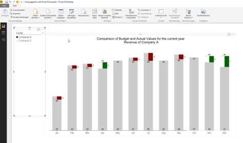
One thing that makes data analysis with Power BI a real pleasure, is the interactivity between the data and the objects used for data visualizations.
For this reason I added some lines to the initial R script:
# read the number of companies (determined by the selection of the Comp slicer)
slicer <- unique(dt.source$Comp)
slicer.count <- length(slicer)
Here I’m determine the selected members (or all the members) and also counting the selected members (from the slicer in the Power BI report). This will become necessary to calculate the width and the proper coordinates of the rectangles.
# creating a vector that contains shades of grey
cols.vector <- NULL
cols.vector <- colorRampPalette(c(“grey80”, “grey50”))( slicer.count )
names(cols.vector) <- slicer;
With the lines above I create a vector that contains colors ranging from “grey80” to “grey50”. This vector will be used later on in the function scale_fill_manual(…). The vector cols.vector is named by the content of the variable slicer. A named vector is one of the fundamentals of R. So this concept / object should be understood for more advanced R programming. Maybe this little analogy will help. I imagine a named vector as some kind of key/value pair, where the key is the name and the value the value. For the example data this will lead to something like this:
key/value
“Company A”/”#CCCCCC”;
“Company B”/”#7F7F7F”;
Looking at the first geom_rect(…), the part … aes(…, fill = Comp …) … maps the content of the column Comp of the dataset to the fill-aesthetic. In combination with the vector cols.vector and the function scale_fill_manual we will become this colorful chart 😉
#determine the levels of the companies shown on the xaxis, to get a numerical value that is used later to draw the rectangles, for each category (Monthname) n-slicer columns are drawn
dt.cast$slicer <- factor(dt.cast$Comp, levels = unique(dt.cast$Comp));
slicer.levels <- levels(dt.cast$slicer);
names(slicer.levels) <- c(levels(dt.cast$slicer));
dt.cast$slicer.level.ordinal <- as.numeric(match(dt.cast$slicer, slicer.levels));
The following lines add new fields to the dataset, these fields are used to determine the proper coordinates of the rectangles, drawn with the geom_rect(…). The geom_rect(…) provides a little more flexibility, than the geom_bar. Especially if you want to interfere with the width of a bar.
In contrast to the example for Reporting Services I use the number of selected members from the Comp slicer to hide or show some details of the chart, this means if there is more than one slicer selected, than I hide some chart details.
if(slicer.count > 1){
…
,chart.columnwidth.default <- 0.9
} else {
…
,chart.columnwidth.default <- 0.6
};
The line below segment.width … creates the anchor value for the width of a bar. Starting by 0.9 (meaning there is a little gap between different categories (the month). The unit of this measure is a relativ measure, you should be aware that a value greater 1, will lead to overlapping bars (even if one can consider data as beautiful, not necessarily art will evolve by this).
#the default width of a bar
#chart.columnwidth.default <- 0.9
segment.width <- chart.columnwidth.default / slicer.count
This value in combination with the number of selected members of the slicer will lead to the proper coordinates for the rectangles.
geom_rect(
…
,aes(
xmin = …
,xmax = …
,…
)
)
C’est ca!
I have to admit, that I’m totally awed by the possibilities of the R integration not just into SQL Server 2016, but also to Power BI! I guess some of the my future posts will be more on the “analytics” side of R, instead of the Data Visualization part 🙂
Thanks for reading!

Thank you!
I’ve got an error when trying opening your pbix file
…
Error Message:
R script error.
Ошибка в svg(filename = rScriptWrapper_currFilename, width = 10, 7083333333333, :
неправильный аргумент pointsize
Вызовы: -> print.ggplot -> grid.newpage -> -> svg
Вдобавок: Предупреждение:
В svg(filename = rScriptWrapper_currFilename, width = 10, 7083333333333, :
NAs introduced by coercion to integer range
Выполнение остановлено
Hey Mikhail, thanks for taking some time to try out the samples … Currently there is an issue with the preview feature using R data visualizations in Power BI. The issue is described here: https://powerbi.microsoft.com/en-us/documentation/powerbi-desktop-r-visuals/ You will find the known issues at the bottom of this article within the section “known limitations”, You have to change your regional setting to “English (World)” and it will work.