Hmm, how can this happen, my last post is more than 12 months old … During this period some things have changed – it seems mostly to the better, and some things are still the same, I’m still in love with data.
My resolution for the year 2017, post more often 🙂
Generic Data Processing Problems
Over the last years I encountered similar problems and had to solve these problems with different tools, for this reason I started to call these kind of problems generic problems. These thinking has proven that I have become much more versatile in developing problem solving solutions and also faster (at least this thinking works for me).
My toolset has not changed in the way that I’m now using this tool instead of that tool, but has changed in the way that I’m now using more tools. My current weapons of choice are SQL (T-SQL to be precise), R, and Power BI.
One problem group is labeled “Subset and Apply”.
Subset and Apply
Subset and Apply means that I have a dataset of some rows where due to some conditions all the rows have to be put into a bucket and then a function has to be applied to each bucket.
The simple problem can be solved by a GROUP BY using T-SQL, the not so simple problem requires that all columns and rows of the dataset have to be retained for further processing, even if these columns are not used to subset or bucket the rows in your dataset.
Subset and Apply – Indexing Rows
What I want to achieve is to create a new column, that shows the rowindex for each row in its subset.
The SQL script, the R script, and the Power BI file can be found here:
https://www.dropbox.com/sh/y180d8q0rcjclxg/AADaHttgsAGBZg4vH55hMMYka?dl=0
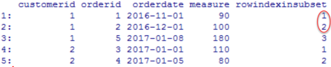
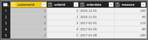
I start with this simple dataset
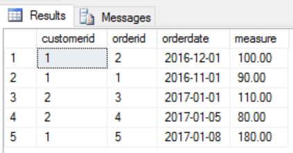
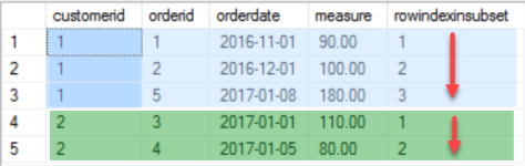
And this is how the result should look like
I like the idea of ensemble modeling or decomposition, for this reason I came up with the following three separate parts that needed a solution
- Create a new column in my dataset
- Build subsets / groups / windows in my dataset
- Apply a function to each of the subsets (I may have to consider some kind of sorting within each group)
Here are some areas of interest where you may encounter this type of problem
- Feature Engineering, create features that represent a sequence for your statistical models
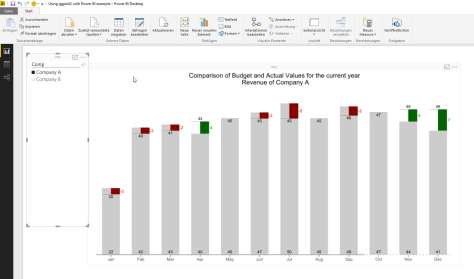
- Create content for a slicer in Power BI, that enables you to compare the 1st order across all customers
- Ensure that points have the correct order if you are tasked with creating complex shapes
- …
Subset and Apply – Indexing Rows – T-SQL
Using T-SQL I’m going to use the OVER() clause and the ROW_NUMBER() function.
The complete T-SQL statement:
Select
basetable.*,
row_number() over(partition by basetable.customerid order by basetable.orderdate, basetable.orderid)
as rowindexinsubset
from
@basetable as basetable;
Because I started my data career with T-SQL this solution seems to be the most obvious.
The subsetting of the dataset is done by PARTITION BY and the ordering by the ORDER BY part of the OVER(…clause), the function that is applied to each subset is ROW_NUMBER()
Subset and Apply – Indexing Rows – R (data.table package)
Please be aware that there are many Packages for R (estimates exists that the # of packages available on CRAN will reach 10thousand) that can help to solve this task, but for a couple of reasons my goto package for almost any data munging task is “data.table”. The #1 reason: performance (most of the time the datasets in question are somewhat larger than this simple one).
Basically the essential R code looks like this:
setkeyv(dt, cols= c("orderdate", "orderid"));
dt[, rowindexinsubset := seq_along(.I), by = list(customerid)];
As I already mentioned, most of the time I’m using the data.table package, and that there are some concise documents available
(https://cran.r-project.org/web/packages/data.table/index.html),
please keep in mind that this post is not about explaining this package but about solving problems using tools, but nevertheless, just two short remarks for those of you who are not familiar with this package:
- A data.table object is of the class data.frame and data.table, this means whenever a function expects a data.frame you can also use a data.table object
- A data.table has its own intricate working in comparison to a data.frame for this reason I urgently recommend you to read the above mentioned documents if you are looking for a great new friend.
Basically a data.table operation is performed using one or all segments within a data.table reference:
dt[ … , … , … ]
The first segment defines the row-filter dt[ rowfilter , … , … ]
The second segment defines the column-operations dt[ … , column-operations , …]
The third segment, is a special segement where different keywords are specifying different things, e.g. the keyword by is used to subset the dataset.
Coming back to the decomposition of the problem this means that
- by = list(customerid) performs the subsetting
- seq_along(.I) is the function that is applied to each subset of the dataset
- rowindexinsubset is the name of a new column that gets its values for each row from the rhs of the assignment expression in the column-operations segment
If the 1st row is omitted, we will see that obviously the “sorting” part is missing that orders the rows in the subset …
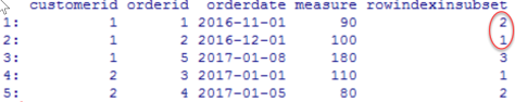
Ordering a data.table or to be precise ordering the rows in a subset is not nearly as obvious as using the OVER(partition by … order by …), but therefore it is fast (this kind of fast that is fast as Iron Fist, even if we are talking about hundreds of millions of rows).
Using setkeyv(dt, cols = c(…)) orders the complete dataset by creating a sorted key, and if we think about it, we will come to the conclusion that this will has no impact on the order of rows in each subset, please have a closer look at the documents if you are more interested in keys in data.table objects (and be assured, you should be).
seq_along(.I), where seq_along(…) is a base R function and corresponds in this simple usage to the ROW_NUMBER() function of T-SQL, whereas .I is a data.table specific parameter, that means each row of the subset is exposed to the function.
Using both rows mentioned above returns the expected result – voila
Subset and Apply – Indexing Rows – Power BI
The same output can be achieved quite easily and if you are somewhat familiar with the GetData component (trying to avoid to use the term Power Query whenever I’m talking about Power BI) it is also easy, but also not that obvious.
Starting with the same dataset …
Coming back to the decomposition of the problem this means that
- The subsetting can be performed quite easily, using the “Group By” – Transform
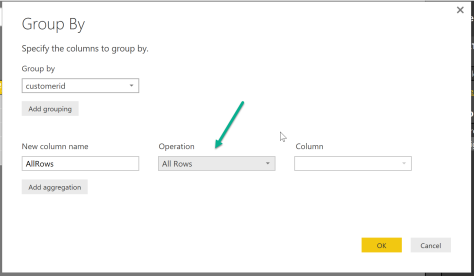
- The application of a function to each row in a subset is not that obvious, but if you are a little familiar with reading the query script that is automagically created for each action you will discover this

- Yes, you are right, I’m talking about the underscore. Replacing the underscore with two combined functions, walking the powerful Excel way (you may also call it – functional programming), and I’m already done
Table.AddIndexColumn( Table.Sort(_, {{"orderdate", 0}, {"orderid" , 0}} ) , "IndexInGroup" ,1,1 )the command each applies the stacked functions to the calling object. The calling object in this case is a subset (the group created by the Table.Group function of the original dataset) that still contains all rows. The first function is Table.AddIndexColumn (the ROW_NUMBER() function of M) and the second function is Table.Sort(…).
The Power BI also contains a query that uses R to create the sample data and also uses R to create the result table, this query is called “completeR”.