As mentioned in my first post
“https://minceddata.wordpress.com/2015/09/30/data-visualization-ggplot2-the-anatomy-of-a-barchart-something-unobvious/” this post is about how to create the chart below, or at least how to create a chart that looks similar to the one below.
But before I come up with the R code that creates a similar chart, I want to provide some theory about bars in data visualization.
In his book “Show me the numbers (2nd edition)” Stephen Few describes a bar as
“… a line with the second dimension of width added to the line’s single dimension of length, which transforms the line into a rectangle. The width of the bar doesn’t usually mean anything; it simply makes each bar easy to see and compare to the others. The quantitative information represented by a bar is encoded by its length and also by its end in relation to a quantitative scale along an axis.”
And then there is the article “Graphical Perception: Theory, Experimentation, and Application to the Development of Graphical Methods” by William S. Cleveland and Robert McGill. In this article the authors order graphical representations of data by the accuracy these representations provide to their audience (the reader of a chart) regarding the “decoding” of information (this article can be found here http://www.jstor.org/stable/2288400?seq=1#page_scan_tab_contents and is in my opinion a must read, even it was written decades ago).
Cleveland and McGill describe that graphical representations of data can be best decoded if they
- are positioned along a common scale (xaxis and yaxis) and if
- the data is encoded by length
According to this article decoding from an area or volume is not that accurate.
And finally there is this concise statement from Hadley Wickham
“A Data Visualization is simply this: a mapping of data to aesthetics (color, shape, size) of geometric objects (points, lines, bars)” taken from “ggplot2 – Elegant Graphics for Data Analysis”.
The above mentioned statements in my mind and all the bar charts I created for different audiences and also looked at as a member of the targeted audience make me think that using just one quantitative variable is often a waste of precious “space”.
For this reason I often try to use one of the other two dimensions (besides the height, there are the width, and the area of a rectangle) to provide meaning. Commonly we interpret a column with a greater length / height in a bar chart more important than columns with a lesser height. Due to the fact, that the area of a graphical object is one of the graphical representations that provide lesser accuracy, I do not recommend using all three dimensions of a bar to provide some meaning like the following following: amount of goods sold (height) * average price (width) = sales (area).
I commonly use just a second “quantitative” variable to provide additional information, adding some extra insight: e.g. sales (height) and number of distinct customer contributing to the sales (width).
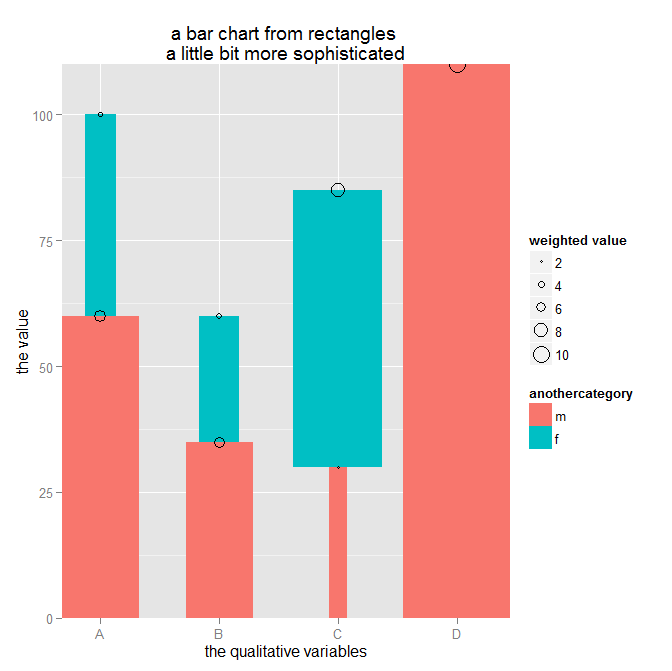
Before starting with some out of the box thinking, I’m using some data to create a simple stacked barchart – why stacked: a stacked barchart is able to encode 2 qualitative variables and one quantitave variable (okay – the same way as a dodged barchart, but I prefer stacked barcharts 🙂 ).
The data
dt.source <- data.table(
category = c(“A”, “A”, “B”, “B”, “C”, “C”, “D”),
anothercategory = c(“m”, “f”, “m”, “f”, “m”, “f”, “m”),
values = c(60, 40, 35, 25, 30, 55, 120),
values2 = c(20,20, 30,10,10, 90,2)
)
The R code to create a stacked barchart (using the ggplot2 package):
p <- ggplot()
p <- p + geom_bar(data = dt.source,
aes(x = attribute, y = measure, fill = attribute2)
,stat = “identity”
,position = “stack”
)
p
The code above creates the following chart:

If I want to use another quantitative variable (measure 2) and change the R script a little
… aes(x = attribute, y = measure, fill = attribute2, width = measure2)
I got an error message. Simply said, it is not possible to use geom_bar(…) and give each individual segment an individual width.
But there is another geom_… that can be used to create the following chart – geom_linerange(…):

I have to admit that maybe it seems a little odd to use the geom_linerange(…) to create a barchart with 2 quantitave and 2 qualitative variables, but this is just another example of the endless possibilities of ggplot2.
Just some out of the box thinking.
First I have to add some additional columns, this is due to the parameters that have to be passed to the geom:
ymin (the starting point of a linerange) and
ymax (the ending point of a linerange)
ymin is simply calculated by determine previous value within a group
dt.source[, ymin := c(0, head(measure, -1)), by = list(attribute)]
The group is determined by “by = list(attribute)“, the by statement subsets the data.table (maybe it is helpful to picture a subset of a data.table as some kind of a SQL Window using a SQL statement like OVER(PARTITION BY …), if you think like that, than ” c(0, head(measure, -1))” is similar to the SQL statement LAG(measure, 1,0).
One line of the resulting dataset will look like this
| attribute | attribute2 | Measure | measure2 | ymin | ymax |
| A | m | 60 | 20 | 0 | 60 |
| … |
The next step is to calculate the percentage of measure2 wihtin the group:
dt.source[,measure2.weighted := measure2 / sum(measure2),by = list(attribute)]
Basically thats all, the following R script
p <- ggplot()
p <- p + ggtitle(“A barchart where the width of \nthe bar has meaning”)
p <- p + geom_linerange(data = dt.source, aes(x = attribute, ymin = ymin, ymax = ymax, color = attribute2, size = as.factor(size)))
p
draws this chart

Admittedly, this looks not completely like the chart I want to share with my audience, but all data preparation (data wrangling, data mincing) has been done.
Everything else is to provide the finishing touch.
I use 2 geom_text() geoms to add labels to the segments:
p <- p + geom_text(data = dt.source, aes(label = measure, x = attribute, y = measure.prev.val + measure), size = 3, color = “white”, vjust = 1.2)
p <- p + geom_text(data = dt.source2, aes(label = sumOfOuterGroup, x = attribute, y = sumOfOuterGroup), size = 3, color = “black”, vjust = -0.8)
and I’m fiddling with the “size” aesthetic of a linerange:
sizeFactor <- 100
size <- dt.source[order(measure2.weighted* 10), measure2.weighted]
size.label <- round(size * sizeFactor,2)
…
p <- p + scale_size_discrete(range = c(size)*sizeFactor , labels = unique(size.label) ,guide = guide_legend(title=”% of measure2\nwithin each group”, override.aes = list(color = “lightgrey”), order = 2))
and I’m fiddling with the color (this is definitely not for the fainthearted. I will cover this in much more detail in one of my upcoming posts 🙂
p <- p + scale_color_manual(values = c(m = “#3F5151”, f = “#9B110E”), guide = guide_legend(title = “the qualitative variable called:\nattribute2”, override.aes = list(size = 10), order = 1 ))
C’est ca!
You can download the complete R script from this Dropbox link
https://www.dropbox.com/sh/uqmhn843n8521zn/AABxe9UhmTulH0hxMp7bCICJa?dl=0
A final word.
I’m using a development version of the ggplot2 package from github due to the fact that the legend is not properly displayed for the aesthetic size (at least not as expected) using the geom_linerange.
The R script shows how I handle the usage of different versions of a R package in one script – in this case ggplot2. This works with my environment, this does not has to work with your environment. If you are not familiar with the R environment you also can use the ggplot2 package from CRAN or one of its mirrors. Just the legend for size will not look the same.
The R script also reference the wesanderson library that provides my favorite color palettes. In the R script I do not use the palette or any function directly just two colors from the “BottleRocket” palette.
My next post will explain how to create a chart inspired by one of the older IBCS standards (http://www.hichert.com/de/excel/excel-templates/templates-2012.html)

Thanks for reading!

