My new website is up and also some new blog posts are written:
During the next few weeks I will recreate my wordpress posts and also my posts from docs.com/minceddata and also adding new content I’m currently working on.
Cheers, Tom
My new website is up and also some new blog posts are written:
During the next few weeks I will recreate my wordpress posts and also my posts from docs.com/minceddata and also adding new content I’m currently working on.
Cheers, Tom
Hmm, how can this happen, my last post is more than 12 months old … During this period some things have changed – it seems mostly to the better, and some things are still the same, I’m still in love with data.
My resolution for the year 2017, post more often 🙂
Over the last years I encountered similar problems and had to solve these problems with different tools, for this reason I started to call these kind of problems generic problems. These thinking has proven that I have become much more versatile in developing problem solving solutions and also faster (at least this thinking works for me).
My toolset has not changed in the way that I’m now using this tool instead of that tool, but has changed in the way that I’m now using more tools. My current weapons of choice are SQL (T-SQL to be precise), R, and Power BI.
One problem group is labeled “Subset and Apply”.
Subset and Apply means that I have a dataset of some rows where due to some conditions all the rows have to be put into a bucket and then a function has to be applied to each bucket.
The simple problem can be solved by a GROUP BY using T-SQL, the not so simple problem requires that all columns and rows of the dataset have to be retained for further processing, even if these columns are not used to subset or bucket the rows in your dataset.
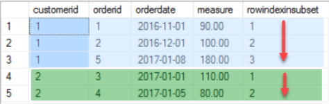
What I want to achieve is to create a new column, that shows the rowindex for each row in its subset.
The SQL script, the R script, and the Power BI file can be found here:
https://www.dropbox.com/sh/y180d8q0rcjclxg/AADaHttgsAGBZg4vH55hMMYka?dl=0
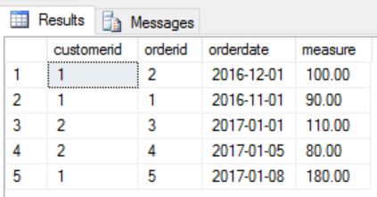
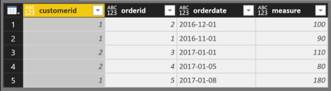
I start with this simple dataset
And this is how the result should look like
I like the idea of ensemble modeling or decomposition, for this reason I came up with the following three separate parts that needed a solution
Here are some areas of interest where you may encounter this type of problem
Using T-SQL I’m going to use the OVER() clause and the ROW_NUMBER() function.
The complete T-SQL statement:
Select
basetable.*,
row_number() over(partition by basetable.customerid order by basetable.orderdate, basetable.orderid)
as rowindexinsubset
from
@basetable as basetable;
Because I started my data career with T-SQL this solution seems to be the most obvious.
The subsetting of the dataset is done by PARTITION BY and the ordering by the ORDER BY part of the OVER(…clause), the function that is applied to each subset is ROW_NUMBER()
Please be aware that there are many Packages for R (estimates exists that the # of packages available on CRAN will reach 10thousand) that can help to solve this task, but for a couple of reasons my goto package for almost any data munging task is “data.table”. The #1 reason: performance (most of the time the datasets in question are somewhat larger than this simple one).
Basically the essential R code looks like this:
setkeyv(dt, cols= c("orderdate", "orderid"));
dt[, rowindexinsubset := seq_along(.I), by = list(customerid)];
As I already mentioned, most of the time I’m using the data.table package, and that there are some concise documents available
(https://cran.r-project.org/web/packages/data.table/index.html),
please keep in mind that this post is not about explaining this package but about solving problems using tools, but nevertheless, just two short remarks for those of you who are not familiar with this package:
Basically a data.table operation is performed using one or all segments within a data.table reference:
dt[ … , … , … ]
The first segment defines the row-filter dt[ rowfilter , … , … ]
The second segment defines the column-operations dt[ … , column-operations , …]
The third segment, is a special segement where different keywords are specifying different things, e.g. the keyword by is used to subset the dataset.
Coming back to the decomposition of the problem this means that
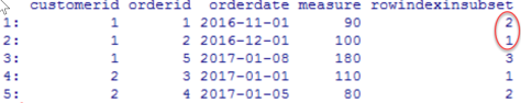
If the 1st row is omitted, we will see that obviously the “sorting” part is missing that orders the rows in the subset …
Ordering a data.table or to be precise ordering the rows in a subset is not nearly as obvious as using the OVER(partition by … order by …), but therefore it is fast (this kind of fast that is fast as Iron Fist, even if we are talking about hundreds of millions of rows).
Using setkeyv(dt, cols = c(…)) orders the complete dataset by creating a sorted key, and if we think about it, we will come to the conclusion that this will has no impact on the order of rows in each subset, please have a closer look at the documents if you are more interested in keys in data.table objects (and be assured, you should be).
seq_along(.I), where seq_along(…) is a base R function and corresponds in this simple usage to the ROW_NUMBER() function of T-SQL, whereas .I is a data.table specific parameter, that means each row of the subset is exposed to the function.
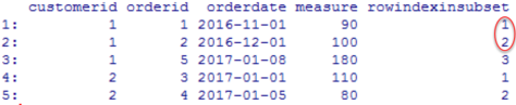
Using both rows mentioned above returns the expected result – voila
The same output can be achieved quite easily and if you are somewhat familiar with the GetData component (trying to avoid to use the term Power Query whenever I’m talking about Power BI) it is also easy, but also not that obvious.
Starting with the same dataset …
Coming back to the decomposition of the problem this means that
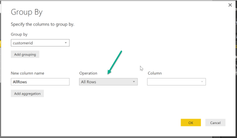

Table.AddIndexColumn( Table.Sort(_, {{"orderdate", 0}, {"orderid" , 0}} ) , "IndexInGroup" ,1,1 )
the command each applies the stacked functions to the calling object. The calling object in this case is a subset (the group created by the Table.Group function of the original dataset) that still contains all rows. The first function is Table.AddIndexColumn (the ROW_NUMBER() function of M) and the second function is Table.Sort(…).
The Power BI also contains a query that uses R to create the sample data and also uses R to create the result table, this query is called “completeR”.
I have to admit that I couldn’t resist to “recycle” my example from here https://minceddata.wordpress.com/2015/12/23/data-visualization-using-r-ggplot2-and-microsoft-reporting-services/ to create the same (almost the same) Data Visualization in combination with Power BI.
You can find the Power BI file (“Using ggplot2 with Power BI example.pbix”) here: https://www.dropbox.com/sh/uxlv7p1m3q6ol8f/AADh3XHUzZ8w7XQPHqV7MI5ua?dl=0
A little note:
I’m using R for Windows Version 3.2.3 (the “Wooden Christmas-Tree” version) and the latest Power BI Desktop Version that you can find here: https://www.microsoft.com/en-us/download/details.aspx?id=45331.
To enable the R visualization preview feature, follow these steps: http://blogs.msdn.com/b/powerbi/archive/2015/12/17/announcing-preview-of-r-visuals-in-power-bi-desktop.aspx
Please keep in mind, that the usage of R based visualizations within Power BI is a preview feature, reports that contain R visualizations can not be published to the Power BI service. Currently this is a Power BI Desktop Feature alone. I would not recommend, to use this in an production environment.
As I already mentioned, the R code is almost the same as in the example for Reporting Services. For this reason I will concentrate on the special stuff that leverages the power of Power BI (sounds a little funny).
One thing that makes data analysis with Power BI a real pleasure, is the interactivity between the data and the objects used for data visualizations.
For this reason I added some lines to the initial R script:
# read the number of companies (determined by the selection of the Comp slicer)
slicer <- unique(dt.source$Comp)
slicer.count <- length(slicer)
Here I’m determine the selected members (or all the members) and also counting the selected members (from the slicer in the Power BI report). This will become necessary to calculate the width and the proper coordinates of the rectangles.
# creating a vector that contains shades of grey
cols.vector <- NULL
cols.vector <- colorRampPalette(c(“grey80”, “grey50”))( slicer.count )
names(cols.vector) <- slicer;
With the lines above I create a vector that contains colors ranging from “grey80” to “grey50”. This vector will be used later on in the function scale_fill_manual(…). The vector cols.vector is named by the content of the variable slicer. A named vector is one of the fundamentals of R. So this concept / object should be understood for more advanced R programming. Maybe this little analogy will help. I imagine a named vector as some kind of key/value pair, where the key is the name and the value the value. For the example data this will lead to something like this:
key/value
“Company A”/”#CCCCCC”;
“Company B”/”#7F7F7F”;
Looking at the first geom_rect(…), the part … aes(…, fill = Comp …) … maps the content of the column Comp of the dataset to the fill-aesthetic. In combination with the vector cols.vector and the function scale_fill_manual we will become this colorful chart 😉
#determine the levels of the companies shown on the xaxis, to get a numerical value that is used later to draw the rectangles, for each category (Monthname) n-slicer columns are drawn
dt.cast$slicer <- factor(dt.cast$Comp, levels = unique(dt.cast$Comp));
slicer.levels <- levels(dt.cast$slicer);
names(slicer.levels) <- c(levels(dt.cast$slicer));
dt.cast$slicer.level.ordinal <- as.numeric(match(dt.cast$slicer, slicer.levels));
The following lines add new fields to the dataset, these fields are used to determine the proper coordinates of the rectangles, drawn with the geom_rect(…). The geom_rect(…) provides a little more flexibility, than the geom_bar. Especially if you want to interfere with the width of a bar.
In contrast to the example for Reporting Services I use the number of selected members from the Comp slicer to hide or show some details of the chart, this means if there is more than one slicer selected, than I hide some chart details.
if(slicer.count > 1){
…
,chart.columnwidth.default <- 0.9
} else {
…
,chart.columnwidth.default <- 0.6
};
The line below segment.width … creates the anchor value for the width of a bar. Starting by 0.9 (meaning there is a little gap between different categories (the month). The unit of this measure is a relativ measure, you should be aware that a value greater 1, will lead to overlapping bars (even if one can consider data as beautiful, not necessarily art will evolve by this).
#the default width of a bar
#chart.columnwidth.default <- 0.9
segment.width <- chart.columnwidth.default / slicer.count
This value in combination with the number of selected members of the slicer will lead to the proper coordinates for the rectangles.
geom_rect(
…
,aes(
xmin = …
,xmax = …
,…
)
)
C’est ca!
I have to admit, that I’m totally awed by the possibilities of the R integration not just into SQL Server 2016, but also to Power BI! I guess some of the my future posts will be more on the “analytics” side of R, instead of the Data Visualization part 🙂
Thanks for reading!
This post is the 3rd post in a series on how to use the R package ggplot2 to create data visualizations, but before delving into R code here comes a little confession.
For a couple of years (decades) I’m an avid user of the SQL Server Data Platform, spanning of course the relational database engine designing and implementing DWHs, but also building analytical applications using MS SQL Server Analysis Services Multidimensional and Tabular. But for a couple of reasons I never get along with the Reporting Services as a platform for Business Intelligence solutions on top of the data stores. With the upcoming release of SQL Server 2016 and Microsoft’s BI strategy (disclosed at the PASS Summit 2015) this will change dramatically.
With the upcoming release of SQL Server 2016, Reporting Services will become the foundation for on premises BI architectures, after the initial release it will also become possible to publish the interactive Power BI Desktop (disclaimer: I’m addicted) Reports and Dashboards to Reporting Services. In the current release of SQL Server 2016 there is already a new web service available (free of Sharepoint) that will host the reports and there already is the possibility to design Dashboards for mobile devices. The technology of DataZen (acquired by Microsoft some time ago) is integrated into Reporting Services.
The above mentioned in combination with the integration of the statistical framework R into the SQL Server 2016 makes this post not just the 3rd in a series on how to create Data Visualizations with R (using ggplot2), but also the first post that describes the benefits of the integration of R into the SQL Server. In this special case how to use R visualizations within SQL Server Reporting Services.
Due to the fact that Microsoft is moving with an unbelievable pace, this post will become somewhat lengthy. This is because this post will of course describe some R scripting to create another Data Visualization, but will also be the beginning of a couple of posts that describe how and much more important why one should use R in combination with SQL Server.
Please be aware, that whenever I mention SQL Server or Reporting Services. I’m referring to the currently available pre-release of SQL Server 2016, known as SQL Server 2016 CTP 3.2
You can find all files in this Dropbox folder https://www.dropbox.com/sh/wsrgpsb6b6jfl6a/AABwsnNFN_djU8i5KUEEHWp7a?dl=0
There is a R script “hichertexample without reporting services.R” that you can use without the Reporting Services, just from within your favorite R IDE. Just be aware that the R script tries to acces a ODBC source called “rdevelop”. To create the table that is used by the R script execute the SQL script from “HichertExample.sql”.
To avoid any confusion, do not use any script, file or anything else I provide on a production environment.
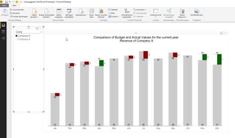
First things first, the data visualization!
This time my custom R visualization was inspired by an older Hichert chart (the inventor of the International Business Charting Standards – IBCS: http://www.hichert.com/). The Excel File that I used for this example can be found here: http://www.hichert.com/excel/excel-templates/templates-2012.html#044A.
We are (I’m) using bar charts to compare qualitative variables, like the chart below:

Actual Values are compared with Budget Values, sometimes Actual Values are missing. In the chart above, Actual Values are missing for the months October to December.
Depending on the use case for the visualization it is also somewhat difficult to identify if the Budget Values are above or below the Actual Values. Not to mention, if there is a trend in the achievement of the Budget Values.
For this reason, I like the charting type below, it easily communicates the gap between the Budget Values and the Actual Values and also visually indicates that Forecast Values were used for the months October to December by using a dotted line for the x-axis.

The chart above shows the Budget Values (grey column) and Actual Values (black line) and the difference between the Budget Values and Actual Values / Forecast Values (months October to December) as a colored rectangle. A red rectangle indicates lower Actual Values and a green rectangle higher Actual Values.
The Budget Value is labeled at the root of the columns, whereas the Actual Values are labeled above or below the Actual Value indicator (the black line).
Now, it’s time to delve into some R code.
There is some kind of data preparation necessary, here is a little screen that depicts the structure of the data:

I call this kind of structure “long format” in contrast to “wide format”. If one wants to visualize data using ggplot2 it’s always a good idea to have the data in the “long format”. To give you an idea if your data has the “long format” or the “wide format” just use this simple rule (truly oversimplified): long format means “more rows” whereas “wide format” means “more columns”. If you are familiar with the SQL operators PIVOT and UNPIVOT, you will know what I’m talking about.
By the way – this sample data can be created using the file “HichertExample.sql”. I would not recommend to execute this SQL statement in a production environment, even if I took great care not to DROP any objects that were not created within the same statement.
Please be aware that I will explain somewhat later in this post how to pass datasets and other variables to a R script that will be executed within the SQL Server (almost within).
But for this special case I want to have my data in the wide format, due to the fact that I will create some additional information depending on the values of the column “DataType”. I call the process of transforming a long dataset into a wide dataset: pivoting (transforming rows into columns).
For this reason I use the following line in my R script:
dt.cast <- dcast(dt.source,Comp + Monthname ~ DataType, value.var = “Revenue” , fun = sum, fill = NA);
This function uses the data.table object “dt.source” and creates a new object “dt.cast”. After applying this function to the data.table “dt.source”, the new data.table will look like this:

Since version 1.9.6 the R package data.table provides the function “dcast” to pivot columns, for this reason it is no longer necessary to use the package reshape2.
For a couple of reasons I always use the package “data.table” for all kinds of data preparation, mainly because of performance and not to lose my focus. I’m aware that there are packages available that also can be used, but I will use the package “data.table” until there will be a package that does all the stuff in a fraction of time (happy waiting!).
As one can see, there are no Actual Values for the month Oct, Nov, and Dec. For this reason, I will create two additional columns that will be used during the charting:
dt.cast[, UseForecastValue := ifelse(is.na(Actual), 1,0)];
dt.cast[, ComparisonValue := ifelse(is.na(Actual), Forecast,Actual)];
The first line creates the column UseForecastColumn and assigns the value 1 if the Actual Value is missing. The second line creates the column ComparisonValue and assigns the value from the Actual column if a value present and from the Forecast column if not.
The next lines ensure that the data.table dt.cast is properly sorted by an index number assigned to a MonthName:
dt.monthordered = data.table(
Monthname = c(“Jan”,”Feb”,”Mar”,”Apr”,”May”,”Jun”,”Jul”,”Aug”,”Sep”,”Oct”,”Nov”,”Dec”),Monthindex = c(1,2,3,4,5,6,7,8,9,10,11,12));
setkey(dt.monthordered,Monthname);
setkey(dt.cast, Monthname);
dt.cast <- merge(dt.cast,dt.monthordered, by = “Monthname”);
setorder(dt.cast, Monthindex);
The first line creates the data.table “dt.monthordered”. The next two lines create an index for the column in the data.tables.
Using merge in the next line combines both data.tables and finally the data.table “dt.cast” gets ordered by the column MonthIndex.
The rectangles, depicting the difference between the Actual / Forecast Value and the Budget Value, are drawn using the geom_rect(…), therefore it is necessary to determine the height of the rectangle, this is done by the next line:
dt.cast[, diffCompareBudget := ComparisonValue – Budget][] #diff ComparisonValue-Budget;
Simply a new column is created “diffCompareBudget”.
The next lines create a numerical index for the values shown on the xaxis, this index is stored in the column “category.level.ordinal”. This value is used later on to determine the coordinates along the xaxis for the rectangles:
dt.cast$category <- factor(dt.cast$Monthname, levels = unique(dt.cast$Monthname));
category.levels <- levels(dt.cast$category);
names(category.levels) <- c(levels(dt.cast$category));
dt.cast$category.level.ordinal <- as.numeric(match(dt.cast$category, category.levels));
Then there are some lines creating boolean values to tweak the chart, this is one of great possibilities provided by the ggplot2 package, build the chart in layesr that can be addes or omitted, just by encapsulating these layers in a simple if-clause:
show.BudgetValues <- TRUE;
show.BudgetLabels <- TRUE;
show.ActualLabels <- TRUE;
show.diffValues <- TRUE;
show.diffLabels <- TRUE;
show.actLine <- TRUE;
show.zeroline <- TRUE;
And of course then the drawing of the chart begins 🙂
Basically this is straightforward …
First an ggplot2 object is initialized using
p <- ggplot();
Each of the used layer of the chart is contained within an if-clause that adds the layer to the chart or not 😉
If(){
P <- p + geom_…(…);
};
In preparation for the usage of this chart in a report of SQL Server Reporting Services the final chart is rendered as a binary object using thes four lines:
image_file = tempfile();
png(filename = image_file,width = 900,height=700,res=144);
print(p);
dev.off();
OutputDataSet <- data.frame(data=readBin(file(image_file, “rb”), what=raw(), n=1e6));
I guess the last line can be a little confusing, for this reason here is some additional explanation:
The stored procedure that executes the R script “sp_execute_external_script” returns an object, a result object. This object has to have the name “OutputDataSet”. The temporarily created file “image_file” is assigned to this result object. Due to the fact that the Reporting Services expect a binary, readBin(…) is used.
And now – some words about the R integration in SQL Server 2016 and the usage of custom Data Visualizations in SQL Server 2016 Reporting Services.
If you want to try this at home 🙂 You have to use this Version of SQL Server 2016: SQL Server 2016 CTP 3.2 (found here: https://technet.microsoft.com/de-de/evalcenter/mt130694.aspx)
During installation of SQL Server, make sure you checked the new “Advanced Analytics Extensions” option and also executed the post-installation process, that is described here (https://technet.microsoft.com/en-us/library/mt590808.aspx).
Due to the fact that custom Data Visualizations in SQL Server Reporting Services are image files (I like that), this part is just very simple. Provide something to Reporting Services that is a binary. I already explained how to create a binary (in my example a png file) from within the R script.
Check!
To leverage the power of R from within SQL Server basically a new system stored procedure “sp_execute_external_script” is executed from within another stored procedure. In my example the stored procedure “dbo.getHichertExample_plot” calls this new system procedure.
The dataset “getHichertExample” of the Report “HichertExample” queries its data using a stored procedure and passes the seleceted company as a parameter to the stored porcedure like this
exec getHichertExample_plot @comp ;
This stored procedure assembles the SQL statement that provides the input data for the R script and executes the new system stored procedure “sp_execute_external script”. This stored procedure and its parameters are described here (https://msdn.microsoft.com/en-us/library/mt604368.aspx). The usage of this procedure is quite simple, assuming you have some T-SQL experience.
To make all this work smoothly it is necessary to consider some security issues, meaning the privileges:
The SQL file “the security stuff.sql” contains the statements that are necessary to provide the proper access rights to make my example work, I guess this could become handy in the future as well.
And after publishing the report to your report server, the report will look like this in the new web portal of Reporting Services 2016:

This simplicity is astonishing; this combines the power of two outstanding platforms in a way that will at least provide topics for my future posts 🙂
Thanks for reading!
As mentioned in my first post
“https://minceddata.wordpress.com/2015/09/30/data-visualization-ggplot2-the-anatomy-of-a-barchart-something-unobvious/” this post is about how to create the chart below, or at least how to create a chart that looks similar to the one below.
But before I come up with the R code that creates a similar chart, I want to provide some theory about bars in data visualization.
In his book “Show me the numbers (2nd edition)” Stephen Few describes a bar as
“… a line with the second dimension of width added to the line’s single dimension of length, which transforms the line into a rectangle. The width of the bar doesn’t usually mean anything; it simply makes each bar easy to see and compare to the others. The quantitative information represented by a bar is encoded by its length and also by its end in relation to a quantitative scale along an axis.”
And then there is the article “Graphical Perception: Theory, Experimentation, and Application to the Development of Graphical Methods” by William S. Cleveland and Robert McGill. In this article the authors order graphical representations of data by the accuracy these representations provide to their audience (the reader of a chart) regarding the “decoding” of information (this article can be found here http://www.jstor.org/stable/2288400?seq=1#page_scan_tab_contents and is in my opinion a must read, even it was written decades ago).
Cleveland and McGill describe that graphical representations of data can be best decoded if they
According to this article decoding from an area or volume is not that accurate.
And finally there is this concise statement from Hadley Wickham
“A Data Visualization is simply this: a mapping of data to aesthetics (color, shape, size) of geometric objects (points, lines, bars)” taken from “ggplot2 – Elegant Graphics for Data Analysis”.
The above mentioned statements in my mind and all the bar charts I created for different audiences and also looked at as a member of the targeted audience make me think that using just one quantitative variable is often a waste of precious “space”.
For this reason I often try to use one of the other two dimensions (besides the height, there are the width, and the area of a rectangle) to provide meaning. Commonly we interpret a column with a greater length / height in a bar chart more important than columns with a lesser height. Due to the fact, that the area of a graphical object is one of the graphical representations that provide lesser accuracy, I do not recommend using all three dimensions of a bar to provide some meaning like the following following: amount of goods sold (height) * average price (width) = sales (area).
I commonly use just a second “quantitative” variable to provide additional information, adding some extra insight: e.g. sales (height) and number of distinct customer contributing to the sales (width).
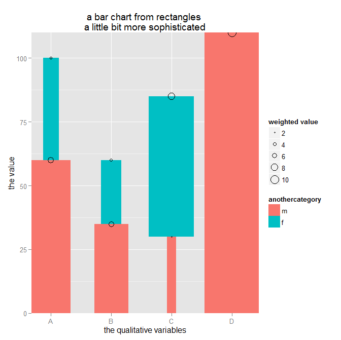
Before starting with some out of the box thinking, I’m using some data to create a simple stacked barchart – why stacked: a stacked barchart is able to encode 2 qualitative variables and one quantitave variable (okay – the same way as a dodged barchart, but I prefer stacked barcharts 🙂 ).
The data
dt.source <- data.table(
category = c(“A”, “A”, “B”, “B”, “C”, “C”, “D”),
anothercategory = c(“m”, “f”, “m”, “f”, “m”, “f”, “m”),
values = c(60, 40, 35, 25, 30, 55, 120),
values2 = c(20,20, 30,10,10, 90,2)
)
The R code to create a stacked barchart (using the ggplot2 package):
p <- ggplot()
p <- p + geom_bar(data = dt.source,
aes(x = attribute, y = measure, fill = attribute2)
,stat = “identity”
,position = “stack”
)
p
The code above creates the following chart:

If I want to use another quantitative variable (measure 2) and change the R script a little
… aes(x = attribute, y = measure, fill = attribute2, width = measure2)
I got an error message. Simply said, it is not possible to use geom_bar(…) and give each individual segment an individual width.
But there is another geom_… that can be used to create the following chart – geom_linerange(…):

I have to admit that maybe it seems a little odd to use the geom_linerange(…) to create a barchart with 2 quantitave and 2 qualitative variables, but this is just another example of the endless possibilities of ggplot2.
Just some out of the box thinking.
First I have to add some additional columns, this is due to the parameters that have to be passed to the geom:
ymin (the starting point of a linerange) and
ymax (the ending point of a linerange)
ymin is simply calculated by determine previous value within a group
dt.source[, ymin := c(0, head(measure, -1)), by = list(attribute)]
The group is determined by “by = list(attribute)“, the by statement subsets the data.table (maybe it is helpful to picture a subset of a data.table as some kind of a SQL Window using a SQL statement like OVER(PARTITION BY …), if you think like that, than ” c(0, head(measure, -1))” is similar to the SQL statement LAG(measure, 1,0).
One line of the resulting dataset will look like this
| attribute | attribute2 | Measure | measure2 | ymin | ymax |
| A | m | 60 | 20 | 0 | 60 |
| … |
The next step is to calculate the percentage of measure2 wihtin the group:
dt.source[,measure2.weighted := measure2 / sum(measure2),by = list(attribute)]
Basically thats all, the following R script
p <- ggplot()
p <- p + ggtitle(“A barchart where the width of \nthe bar has meaning”)
p <- p + geom_linerange(data = dt.source, aes(x = attribute, ymin = ymin, ymax = ymax, color = attribute2, size = as.factor(size)))
p
draws this chart

Admittedly, this looks not completely like the chart I want to share with my audience, but all data preparation (data wrangling, data mincing) has been done.
Everything else is to provide the finishing touch.
I use 2 geom_text() geoms to add labels to the segments:
p <- p + geom_text(data = dt.source, aes(label = measure, x = attribute, y = measure.prev.val + measure), size = 3, color = “white”, vjust = 1.2)
p <- p + geom_text(data = dt.source2, aes(label = sumOfOuterGroup, x = attribute, y = sumOfOuterGroup), size = 3, color = “black”, vjust = -0.8)
and I’m fiddling with the “size” aesthetic of a linerange:
sizeFactor <- 100
size <- dt.source[order(measure2.weighted* 10), measure2.weighted]
size.label <- round(size * sizeFactor,2)
…
p <- p + scale_size_discrete(range = c(size)*sizeFactor , labels = unique(size.label) ,guide = guide_legend(title=”% of measure2\nwithin each group”, override.aes = list(color = “lightgrey”), order = 2))
and I’m fiddling with the color (this is definitely not for the fainthearted. I will cover this in much more detail in one of my upcoming posts 🙂
p <- p + scale_color_manual(values = c(m = “#3F5151”, f = “#9B110E”), guide = guide_legend(title = “the qualitative variable called:\nattribute2”, override.aes = list(size = 10), order = 1 ))
C’est ca!
You can download the complete R script from this Dropbox link
https://www.dropbox.com/sh/uqmhn843n8521zn/AABxe9UhmTulH0hxMp7bCICJa?dl=0
A final word.
I’m using a development version of the ggplot2 package from github due to the fact that the legend is not properly displayed for the aesthetic size (at least not as expected) using the geom_linerange.
The R script shows how I handle the usage of different versions of a R package in one script – in this case ggplot2. This works with my environment, this does not has to work with your environment. If you are not familiar with the R environment you also can use the ggplot2 package from CRAN or one of its mirrors. Just the legend for size will not look the same.
The R script also reference the wesanderson library that provides my favorite color palettes. In the R script I do not use the palette or any function directly just two colors from the “BottleRocket” palette.
My next post will explain how to create a chart inspired by one of the older IBCS standards (http://www.hichert.com/de/excel/excel-templates/templates-2012.html)

Thanks for reading!
Some Weeks ago I started blogging, and started with the first part of a series about the not that obvious aspects of charting using the well known (not to say famous) R package gglot2 (developed by Hadley Wickham).
This post is not part of this series, but just due to my enthusiasm for the integration of R into SQL Server 2016 and the possibilities that come with this integration.
If you want to try it by yourself you can find the preview version of SQL Server 2016 here:
https://www.microsoft.com/en-us/evalcenter/evaluate-sql-server-2016
Please be aware that this is the CTP (Community Technology Preview) 3.0 and for this reason, you should not use this release in a production environment and also not on a machine that is used for development earning money to pay your rent. If you want to use R from T-SQL (meaning as an external script 🙂 ) please make sure that you select the feature “Advanced Analytics” within the feature selection list during installation.
There are also some sample files available:
https://www.microsoft.com/en-us/download/details.aspx?id=49502
The zip-archive “SQLServer2016CTP3Samples” contains the document “Getting Started.docx” in the folder “Advanced Analytics”. This document explains how to install the additional components that are necessary to get your R integration up and running (pretty straightforward explanation).
The above mentioned components can be found here:
https://msdn.microsoft.com/en-US/library/mt604883.aspx
My first experiment using the R integration from SQL Server 2016 CTP 3.0 was inspired by one of the older IBCS (International Business Charting Standards) Templates from 2012 that can be found here:
http://www.hichert.com/excel/excel-templates/templates-2012.html#044A
The result of my first experiment:

I hope that by the end of the week I have finished the 2nd part of the ggplot2 series and also the 3rd part that already explains how to create the chart above using R charting and SQL Server Reporting Services 2016.
Keep on charting, it’s Rsome 🙂
Due to the fact that this is my first post I want to explain why I started blogging now and why I choose this Topic, and why I choose the R package ggplot2 to explain the anatomy of such a simple Thing as a barchart in comparison to the more fancy data visualizations that can be found using your favorite search engine (sooner or later, rather sooner) I will also share some of my D3 experiences).
I start blogging for a simple reason, a great deal of my knowledge comes from reading other blogs, where people are sharing their insights into data related topics, and now I’m feeling confident to start a blog by myself, hoping that other people can also learn something useful, and if not, I’m hoping that some of my posts are interesting enough to add a piece to the information lake, and do not add to the information swamp.
One of the main interests I have in data, is the visualization of data, not just because it’s one of the most discussed topics in the “data is the new oil / soil” realm, but because my personal belief is that it truly helps to convey meaning from data and also helps people to better understand their data. Maybe data visualization is some kind of data language or somehow works like the babel fish. This is the reason why I will start my blog with this post that also will mark the beginning of a little series about the anatomy of charts.
In my opinion it is necessary to understand the foundations of a data visualization before it will be possible to create more sophisticated (some may like to call it – fancy) visualizations. In this little series I choose the R package ggplot2 (developed by Hadley Wickham) for the data visualizaton mainly for two reasons.
First, ggplot2 is a visualization package that adhers to the Grammar of Graphics, introduced by Leland Wilkinson (http://www.amazon.com/The-Grammar-Graphics-Statistics-Computing/dp/0387245448).
Second – I can’t wait to combine the Microsoft Reporting Services weith R visualizations, this will also provide a lot of possibilities for future posts (in the meantime you can read about this feature here: http://www.jenunderwood.com/2014/11/18/r-visualizations-in-ssrs/)
This post will be about
Please be aware that all the images and R.scripts can be downloaded from here: https://www.dropbox.com/sh/ifltrhw4yyv92ll/AAC79m0WNSr-GZE1kxMepT4ma?dl=0
So let’s start with a very simple barchart, like the one below …

The chart above was created using the script “anatomy of charts – part 1 – the barchart – 1.R”
Please be aware that this is not about why we should use a barchart or should use a pie chart or better not use a pie chart, but this is about some of the not that obvious aspects of charts and in this special case about some unobvious aspects of a bar chart.
This chart is based on a very simple dataset, that just has 2 variables:
category (the values are “A”, “B”, “C” and “D”) and
values (the values are 100, 80, 85 and 115)
This little R script creates the chart above:
library(ggplot2)
library(data.table)
dt.source <- data.table(category = c(“A”, “B”, “C”, “D”), values = c(100, 80,85,110))
p <- ggplot()
p <- p + labs(title = “a simple barchart”)
p <- p + geom_bar(data = dt.source, aes(x = category, y = values), stat = “identity”)
p
Before delving into ggplot2, I want to explain what’s happening if I’m executing the lines above.
The line
p <- ggplot()
creates an ggplot object and assigns the object to the variable p.
The line
p <- p + labs(title = “a simple barchart”)
adds a title to the plot.
The line
p <- p + geom_bar(…)
Adds a layer to the plot. A ggplot2 chart consists at least of one layer, in this example a barchart. Adding multiple layers to a chart is one of the great capabilities of ggplot2.
If you are not that familiar with ggplot2, you may wonder what this line
,stat = “identity”
is about:
Stats, are statistical transformations that can be used in combination with the graphical representations of data. These representations are provided by the different geom_… (see here for all the geoms http://docs.ggplot2.org/current/) available from within ggplot2.
The default stat for a barchart counts the observations of the variable used as xaxis, so that it is not necessary to “map” a variable to the y parameter of the geom_bar object. But normally I want to use a specific variable from the dataset to represent the value for the yaxis. This makes it necessary to provide the line
stat = “identity”.
Before digging deeper, this post will not and can not explain all the possibilities of the ggplot2 package or all the possibilities that come with R, so what I expect from the reader of this post is the following: you already have R installed, you are able to install the needed packages, if you are hinted by the library function that the specified package is not available. If you are more familiar with the R object data.frame than with a data.table object, it does not matter, at least not for this post, just a very short explanation: a data.table is a data.frame but much, much more efficient.
If you stare at the barchart, you will discover that there are spaces between the single bars (guess this does not take that much time), of course the three spaces between the bars are enhancing the readibility of the chart. But the question is, why do they appear and if needed, how can these spaces be controlled.
By default the width of a single bar is 0.9 units (whatever the units are) and is automatically centered above the corresponding variable (used as the x-axis of the chart). This means, that 0.45 units are left from the center and 0.45 units are on the right side of the center. The next images shows the same chart, the left image uses a barwidth of 0.5 and the right one a barwidth of 1.0.

The chart above was created with the R script “anatomy of charts – part 1- the barchart – 2.R”)
You can control the width for all the bars in a plot using the property width outside of the function aes(…) like this
p <- ggplot()
p <- p + geom_bar(data = dt.source, aes(x = category, y = values)
, stat = “identity”
,width = 0.5
)
p
If you are not that familiar with ggplot2, each geom, in this case geom_bar, has some aesthetics, for example the aesthetic “fill” that controls the background color for each bar, I will use this aesthetic somewhat later. Parameters or aesthetics used outside of the function aes(…) will set a value for the complete geom, whereas used inside the function, a variable of the dataset is mapped to that aesthetic and automatically scaled. The scaling of variables during the process of the mapping will be explained in a separate post in the near future. For now, please be assured that this will automagically produces the results that you want, in most of the cases.
I guess you also have discovered that there is some kind of margin on the left side of category A and also of the right side of category D. Not to mention the space between the bars and the x-axis. I colored these spaces red, blue and darkgreen. The next image shows the mentioned system areas (system areas if you are drawing a barchart), the property of the width of the bars has the value 1.0 (no spaces between the bars):

The chart above was created using the R script “anatomy of charts – part 1- the barchart – 3.R”
Looking at the script “anatomy of charts – part 1- the barchart – 3.R” you will discover one of the most intriguing aspects of ggplot and that is the possibility to create visualizations of multiple layers of geoms. The chart above consists of 4 layers:
p <- ggplot()
p <- p + geom_bar(data = dt.source, aes(x = category, y = values)
,stat = “identity”
,width = 1.0)
#…
# mark the system area at the bottom of the chart
p <- p + geom_rect(aes(xmin = -Inf, xmax = Inf, ymin = -Inf, ymax = 0)
,color = “darkgreen”
,fill = “darkgreen”
)
p
First an “empty” ggplot object “p” is created, than a geom_bar(…) is added to the object (layer 1) and then a geom_rect() is added in this script example it represents layer 2 of the ggplot object and finally the object is called, this leads to the drawing of the plot.
Each geom that is used can have its own dataset (this is the case for this example) or use a shared dataset. This capability (the layering of geoms_*) provides the possibility to build sophisticated data visualizations very easily.
The system areas (red, blue, and darkgreen) are helpful if you do not want to overlook points that would be drawn very closely to one of the axis or even on top of the axis. But this extra space is rarely used in business charts at least to my experience, for this reason I often use the following lines in my data visualizations:
p <- p + scale_x_discrete(expand = c(0,0))
p <- p + scale_y_continuous(expand = c(0,0))
These lines prevent the plotting of the extra spaces, the next image shows the effect of using these two additional lines (“anatomy of charts – part 1 – the barchart – 4.R”) in the script from the start.

In the next few paragraphs (before finishing my first post) I want to explain why I like to think about rectangles instead of bars.
First, looking at the parameters of the aes-function of the
geom_rect(…, aes(xmin, xmax, ymin, ymax, …)), it looks somewhat familiar to the parameters of the
geom_bar(…, aes(x, y, …),…).
If I’m saying that a rectangle (some may call it a bar), that is drawn by geom_bar, starts or has its origin on the x-axis (y = 0) and geom_bar takes care of the direction of the bar (plus or minus values), I just need to provide one value for the height of the bar.
So I guess it is valid to say that the parameter ymin can be omitted (defaulted to 0) and ymax of geom_rect() corresponds to the parameter y of geom_bar().
The explanation how x from geom_bar() translates to xmin and xmax of geom_rect will not be that easy, but once understood, this provides a lot of possibilities.
It will be necessary to understand that there are two types of variables within a dataset: quantitative and qualitative. In the little dataset that I use for this post this distinction can be made very easily.
The variable “category” is the qualitative variable and the variable “values” is the quantitative variable. Almost naturally we map the variable category to the xaxis and the variable values to the yaxis. It is necessary to understand that the values of the qualitative variables are indexed, “A” is indexed with the numerical value 1, and “C” with the numerical value 3. The first (the leftmost) value of the qualitative variable always has the index 1 and last (the rightmost) the value n (n represents the number of distinct values of the qualitative variable).
This leads to the following parameters for geom_rect for A and C:
A(1) := xmin = 1-(0.9/2), xmax=1+(0.9/2), ymin = 0, ymax = 100
C(3) := xmin = 3 -(0.9/2), xmax = 3+(0.9/2) , ymin = 0, ymax = 110

The chart above was drawn by the script “anatomy of charts – part 1 – the barchart – 5.R”
In the next post I will explain how the below barchart is drawn and how to mince your data in preparation for the drawing using the data.table package:
